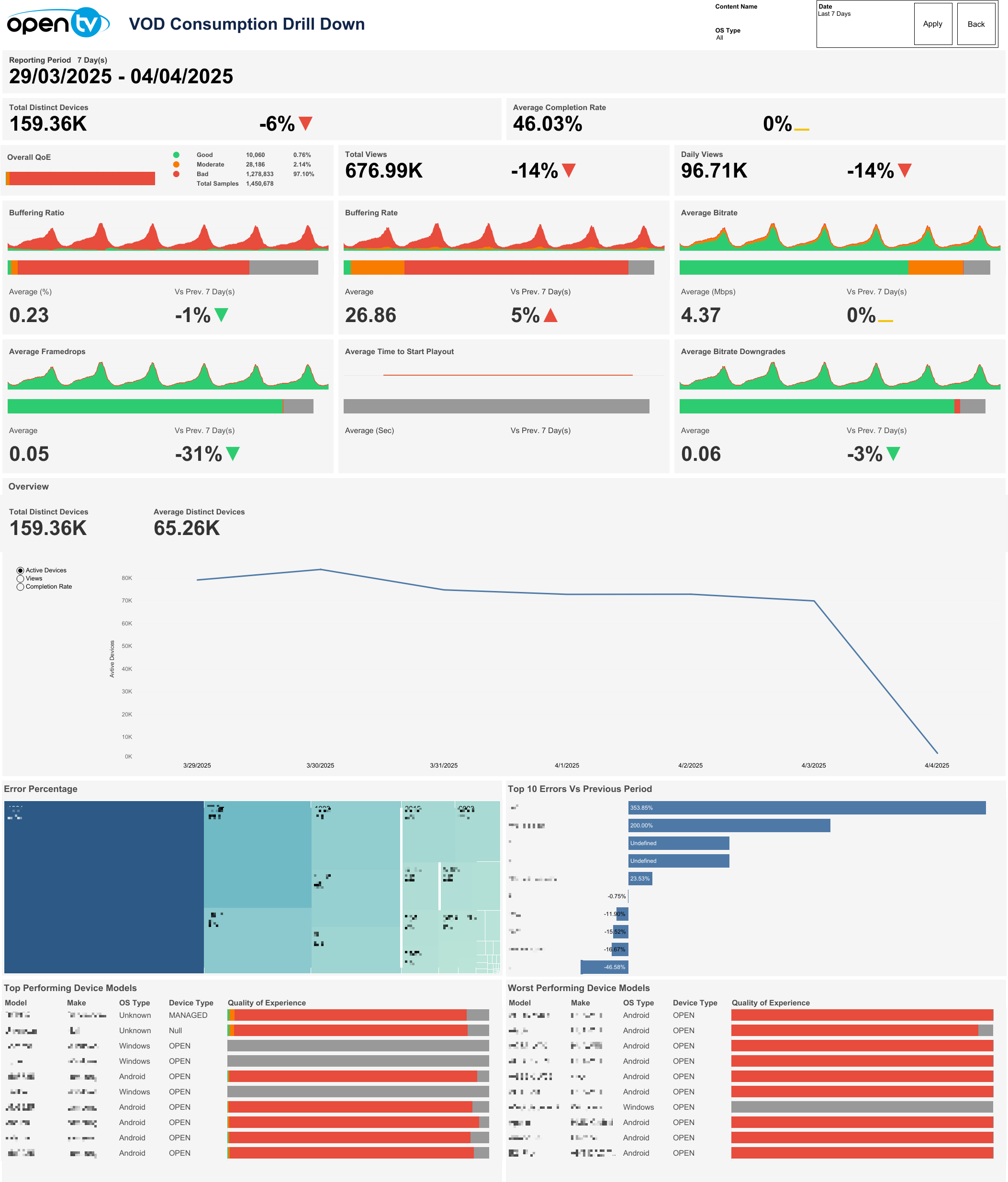
VOD Drill Down
This page displays the VOD Drill Down data. The default period shows a reporting period of one day, with sheets for Total Distinct Devices, Average Completion Rate, Overall QoE, Total Views, Daily Views, Buffering Ratio, Buffering Rate, Average Bitrate, Average Framedrops, Average Time to Start Playout, and Average Bitrate Downgrades over the selected time period.
Below these, the report contains a chart showing Active Devices, Views, and Completion Rate, followed by an Error Percentage chart, Top 10 Errors Vs Previous Period chart, and Top/Worst Performing Device Models chart over the selected time period.
Search, filter, and date selection
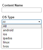
The top right of the page shows a Content Name search box and OS Type drop-down menu showing available OS types.
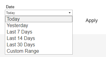
Next to this is a Date drop-down menu, with preset time intervals for Today, Yesterday, Last 7 days, Last 14 days, and Last 30 days. Selecting one of these options and then clicking Apply loads the data.
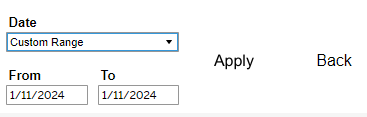
Users can also select Custom Range, which causes the From and To date fields to appear below, and allows users to specify any time interval (provided dates are not in the future). Users must then click Apply to load the data.
A Back button is also shown at the top right of this page. Clicking it returns the user to the Overview page.

Below the top-left page title, the report shows the selected Reporting Period day count and specific dates chosen.

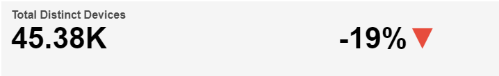
Total Distinct Devices
Below the Reporting Period, the report shows Total Distinct Devices based on the selected time interval. The Total Distinct Device count based on selected time interval is shown with the percentage change in Total Distinct Device count compared to the directly preceding time interval and an up/down/neutral indicator arrow. A mouseover tooltip for each measure gives further information and definitions.
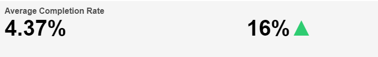
Average Completion Rate
Next, Average Completion Rate shows the Average Completion Rate percentage based on the selected time interval, along with the percentage change in Average Completion Rate compared to the directly preceding time interval and an up/down/neutral indicator arrow. A mouseover tooltip for each measure gives further information and definitions.
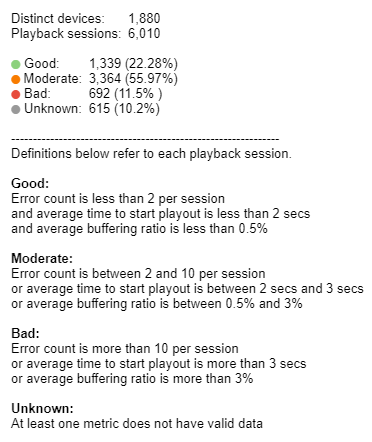
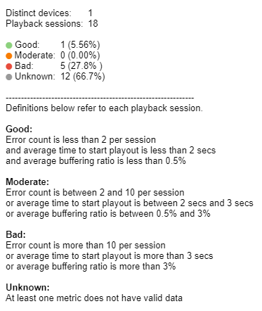
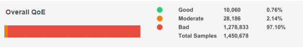
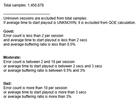
Overall QoE
Next, the report shows Overall QoE. A mouseover tooltip for each measure gives further information and definitions.
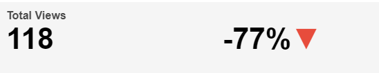
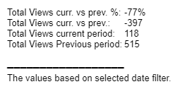
Total Views
Next, the report shows Total Views. A count is shown with the percentage change in Total Views compared to the directly preceding time interval and an up/down/neutral indicator arrow. A mouseover tooltip for each measure gives further information and definitions.
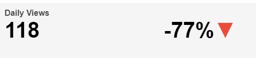
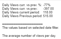
Daily Views
Next, the report shows Daily Views. A count is shown with the percentage change in Daily Views compared to the directly preceding time interval and an up/down/neutral indicator arrow. A mouseover tooltip for each measure gives further information and definitions.
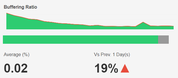
Buffering Ratio
This chart shows the count of sessions reporting good, moderate, and bad buffering ratios based on the selected time interval and filters. A QoE bar is shown below the chart.
The average buffering percentage based on the selected time interval and filters is shown at the bottom left and the percentage change compared to the directly preceding time interval is shown with an up/down/neutral indicator arrow at the bottom right.
Individual regions can be highlighted by single-clicking. The mouseover tooltip gives further information and definitions.
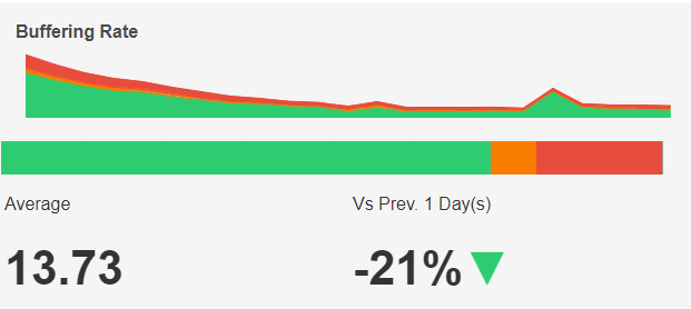
Buffering Rate
This chart shows the count of sessions reporting good, moderate, and bad buffering events based on the selected time interval and filters. A QoE bar is shown below the chart.
The average number of buffering events based on the selected time interval and filters is shown at the bottom left and the percentage change compared to the directly preceding time interval is shown with an up/down/neutral indicator arrow at the bottom right.
Individual regions can be highlighted by single-clicking. The mouseover tooltip gives further information and definitions.
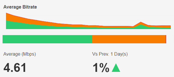
Average Bitrate
This chart shows the count of sessions reporting good, moderate, and bad average bitrate based on the selected time interval and filters. A QoE bar is shown below the chart.
The average bitrate based on the selected time interval and filters is shown at the bottom left and the percentage change compared to the directly preceding time interval is shown with an up/down/neutral indicator arrow at the bottom right.
Individual regions can be highlighted by single-clicking. The mouseover tooltip gives further information and definitions.
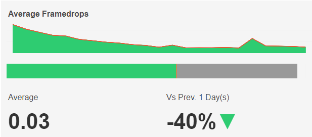
Average Framedrops
This chart shows the count of sessions reporting good, moderate, and bad average framedrops based on the selected time interval and filters. A QoE bar is shown below the chart.
The average framedrops based on the selected time interval and filters is shown at the bottom left and the percentage change compared to the directly preceding time interval is shown with an up/down/neutral indicator arrow at the bottom right.
Individual regions can be highlighted by single-clicking. The mouseover tooltip gives further information and definitions.
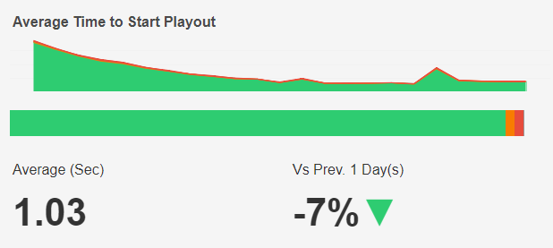
Average Time to Start Playout
This chart shows the count of sessions reporting good, moderate, and bad average time to start playout based on the selected time interval and filters. A QoE bar is shown below the chart.
The average time to start playout based on the selected time interval and filters is shown at the bottom left and the percentage change compared to the directly preceding time interval is shown with an up/down/neutral indicator arrow at the bottom right.
Individual regions can be highlighted by single-clicking. The mouseover tooltip gives further information and definitions.
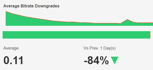
Average Bitrate Downgrades
This chart shows the count of sessions reporting good, moderate, and bad average bitrate downgrades based on the selected time interval and filters. A QoE bar is shown below the chart.
The average bitrate downgrades based on the selected time interval and filters is shown at the bottom left and the percentage change compared to the directly preceding time interval is shown with an up/down/neutral indicator arrow at the bottom right.
Individual regions can be highlighted by single-clicking. The mouseover tooltip gives further information and definitions.
Overview
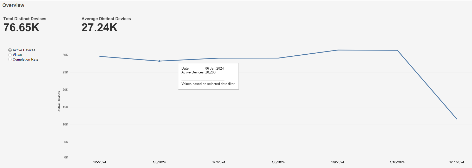
Active Devices graph
This graph shows total distinct devices at the top left, average distinct devices at the top right, and a graph of active device count over time based on the selected time interval. A mouseover tooltip gives further information.
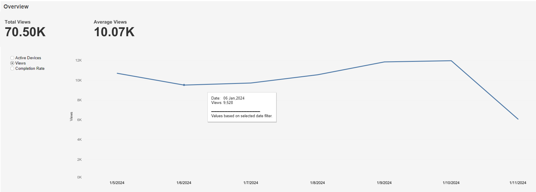
Views graph
This graph shows total views at the top left, average views at the top right, and a graph of views over time based on the selected time interval. A mouseover tooltip gives further information.
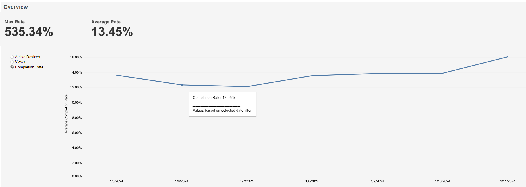
Completion Rate graph
This graph shows max rate at the top left, average rate at the top right, and a graph of views over time based on the selected time interval. A mouseover tooltip gives further information.
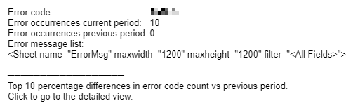
Error Percentage
Below these sheets, the report shows a tiled area chart for Error Percentage. The area of each tile corresponds to the percentage of each error code contributing to the total based on selected filters. A mouseover tooltip gives further information and definitions.
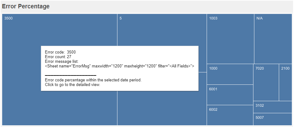
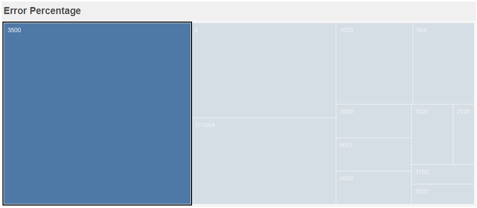
Single-clicking any area tile highlights the selected area and hides all others.
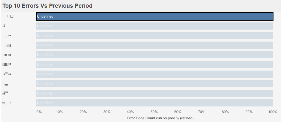
Top 10 Errors Vs Previous Period
This table ranks the percentage change in occurrences of each error when compared to the directly preceding time interval. The list is sorted by percentage change. A mouseover tooltip gives further information and definitions.
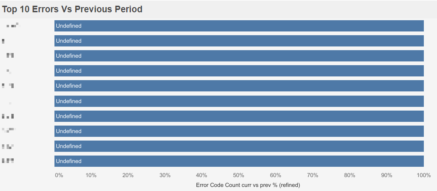
Single-clicking any row highlights the selected row and hides all others.
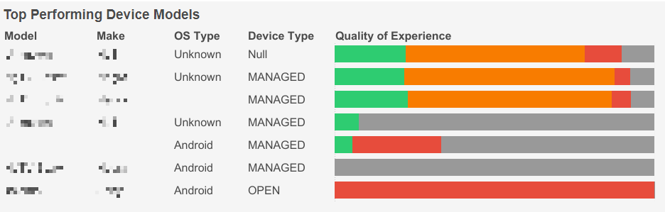
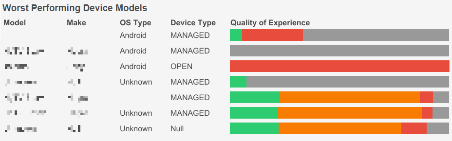
Top/Worst Performing Device Models
These tables rank the 10 top/worst devices based on selected filters. Top Performing Device Models is sorted by distinct device count (descending) and Worst Performing Device Models is sorted by the % of devices classed as having bad QoE (descending).
A mouseover tooltip gives further information and definitions when hovering over the Quality of Experience column.