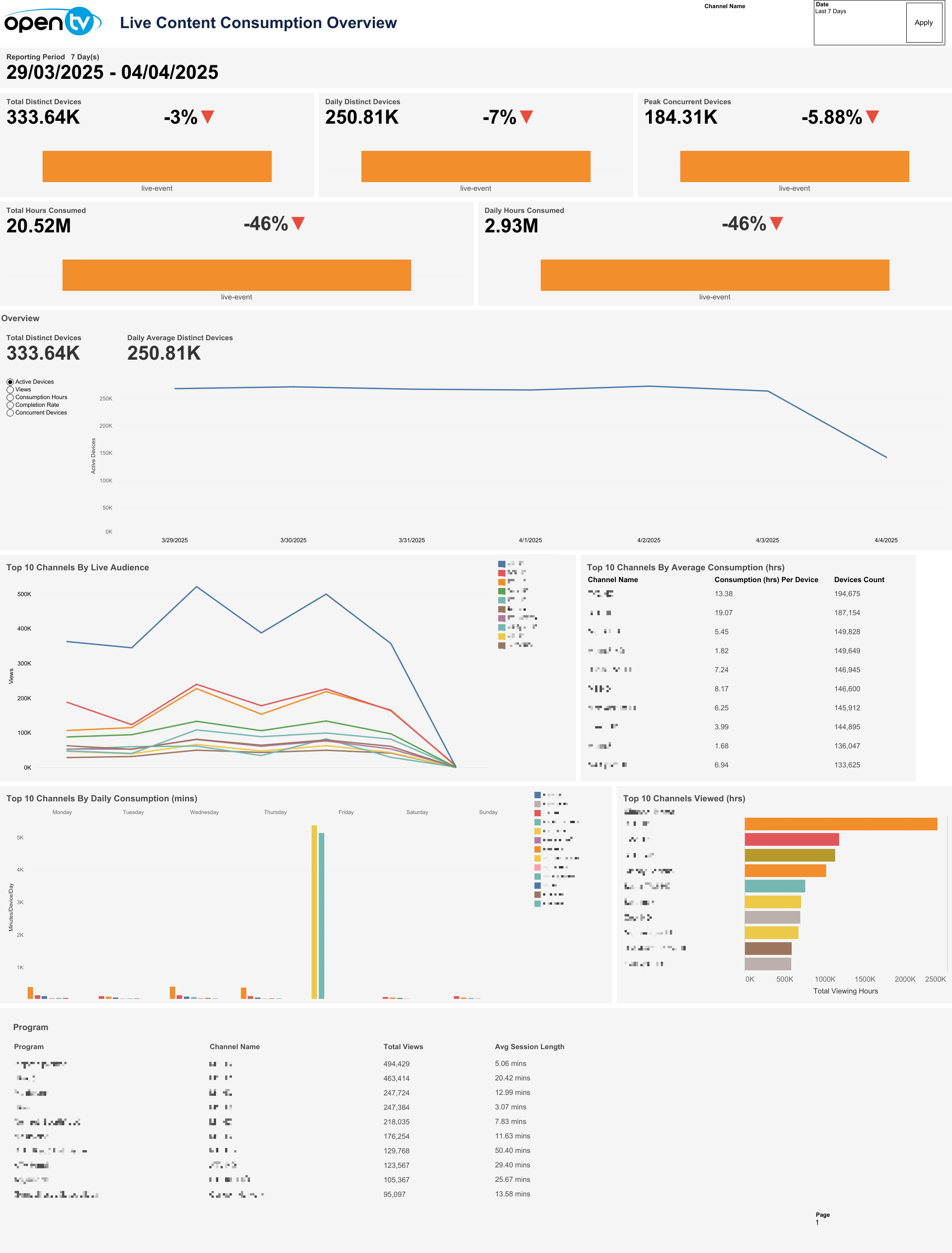
Live Content Consumption Overview
This page displays the live content consumption data. The default period shows a reporting period of one day, with sheets for Total Distinct Devices, Daily Distinct Devices, Peak Concurrent Devices, Total Hours Consumed, Daily Consumption In Hours, Top 10 Channels By Live Audience, Top 10 Channels By Average Consumption (hrs), Top 10 Channels By Daily Consumption (mins), Top 10 Channels Viewed (hrs), a Program table, and a chart showing Active Devices, Views, Consumption Hours and Concurrent Devices over the selected time period.
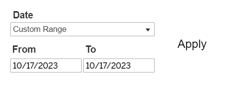
Date selection
The top right of the page shows a Channel Name search field. Entering a relevant channel name and clicking Apply will filter the results accordingly.

Next is a Date drop-down menu, with preset time intervals for Today, Yesterday, Last 7 days, Last 14 days, and Last 30 days. Selecting one of these options then clicking Apply loads the data.
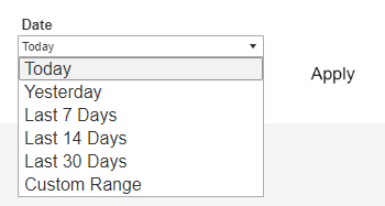
Users can also select Custom Range, which causes the From and To date fields to appear below, and allows users to specify any time interval (provided dates are not in the future). Users must then click Apply to load the data.
Selecting a 'From' date which lies in the future causes the Apply button to disappear:

Below the top-left page title, the report shows the selected reporting period day count and specific dates chosen.

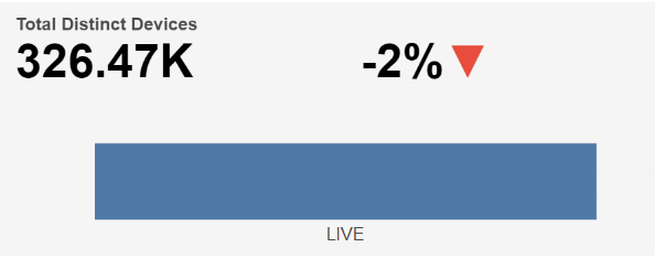
Total Distinct Devices
Below the top-left Reporting Period, the report shows a bar chart for Total Distinct Devices, based on the selected time interval.
The Total Distinct Device count based on selected time interval is shown at the top left and the percentage change in Total Distinct Device count compared to the directly preceding time interval is shown with an up/down/neutral indicator arrow at the top right.
Individual regions can be highlighted by single-clicking. A mouseover tooltip for each measure gives further information and definitions.
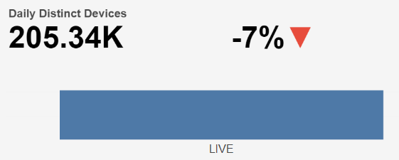
Daily Distinct Devices
Next, the report shows a bar chart for Daily Distinct Devices, based on the selected time interval.
The Daily Distinct Device count based on selected time interval is shown at the top left and the percentage change in Daily Distinct Device count compared to the directly preceding time interval is shown with an up/down/neutral indicator arrow at the top right.
Individual regions can be highlighted by single-clicking. A mouseover tooltip for each measure gives further information and definitions.
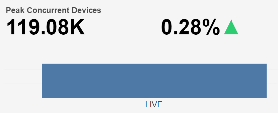
Peak Concurrent Devices
Next, the report shows a bar chart for Peak Concurrent Devices, based on the selected time interval.
The Peak Concurrent Device count based on selected time interval is shown at the top left and the percentage change in Peak Concurrent Device count compared to the directly preceding time interval is shown with an up/down/neutral indicator arrow at the top right.
Individual regions can be highlighted by single-clicking. A mouseover tooltip for each measure gives further information and definitions.
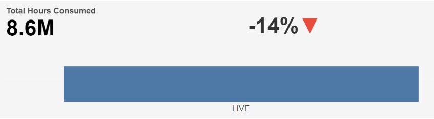
Total Hours Consumed
Below this, the report shows a bar chart for Total Hours Consumed, based on the selected time interval.
The Total Hours Consumed based on selected time interval is shown at the top left and the percentage change in Total Hours Consumed compared to the directly preceding time interval is shown with an up/down/neutral indicator arrow at the top right.
Individual regions can be highlighted by single-clicking. A mouseover tooltip for each measure gives further information and definitions.
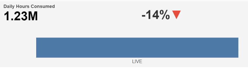
Daily Hours Consumed
Next, the report shows a bar chart for Daily Consumption In Hours, based on the selected time interval.
The Daily Consumption In Hours based on selected time interval is shown at the top left and the percentage change in Daily Consumption In Hours compared to the directly preceding time interval is shown with an up/down/neutral indicator arrow at the top right.
Individual regions can be highlighted by single-clicking. A mouseover tooltip for each measure gives further information and definitions.
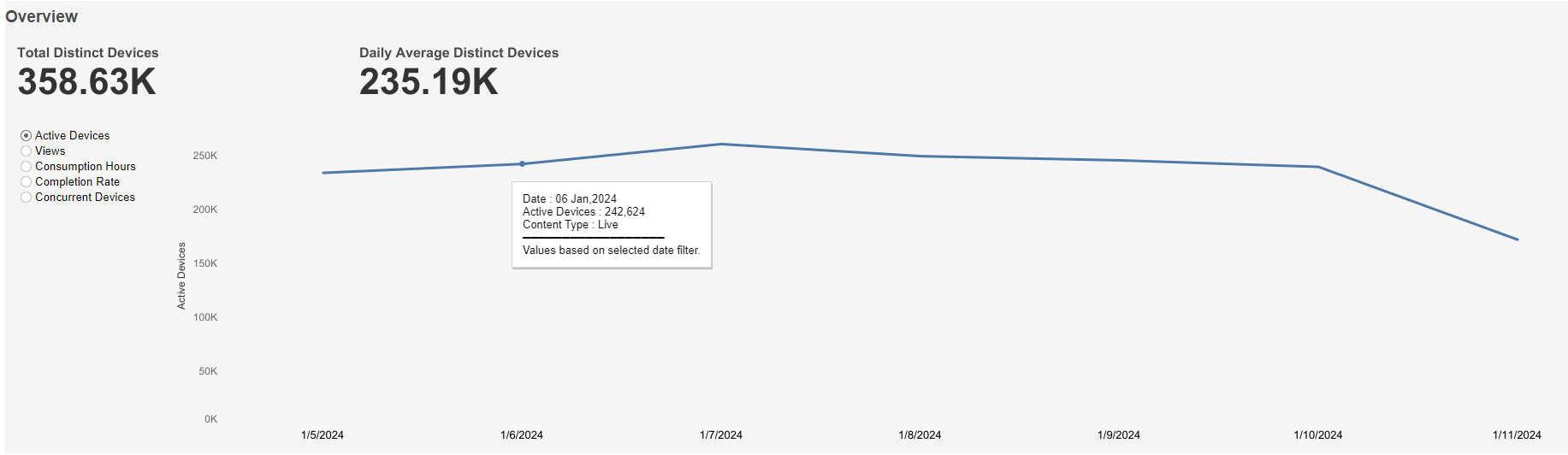
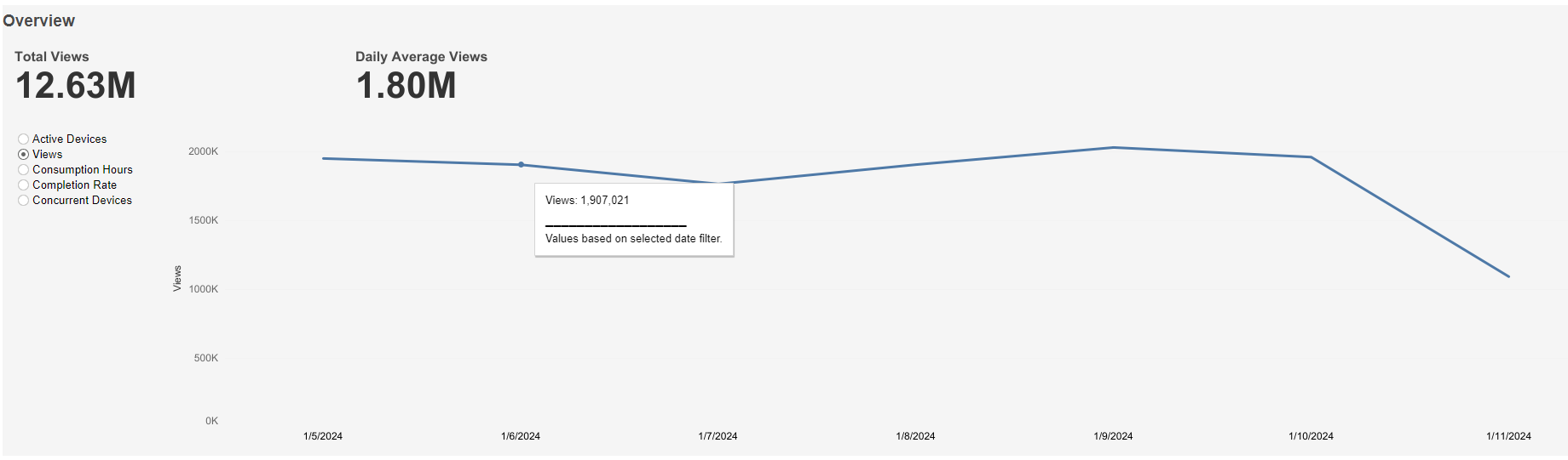
Overview
Active Devices graph
This graph shows Total Distinct Devices at the top left, Daily Average Distinct Devices at the top right, and a graph of Active Device count over time based on the selected time interval. A mouseover tooltip gives further information.
Views graph
This graph shows Total Views at the top left, Daily Average Views at the top right, and a graph of Views over time based on the selected time interval. A mouseover tooltip gives further information.
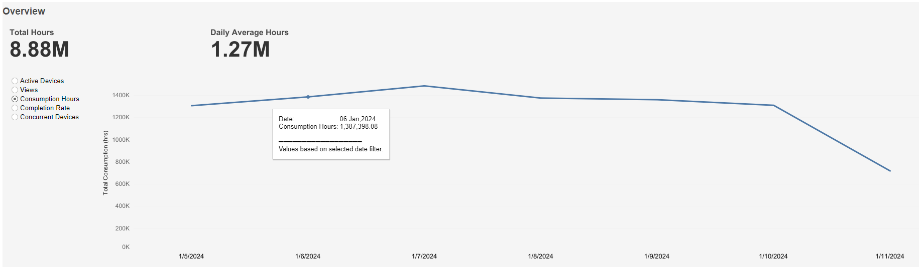
Consumption Hours graph
This graph shows Total Hours at the top left, Daily Average Hours at the top right, and a graph of Consumption Hours over time based on the selected time interval. A mouseover tooltip gives further information.
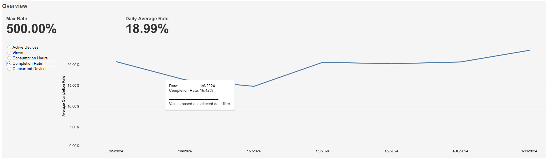
Completion Rate graph
This graph shows Max Rate at the top left, Daily Average Rate at the top right, and a graph of Average Completion Rate over time based on the selected time interval. A mouseover tooltip gives further information.
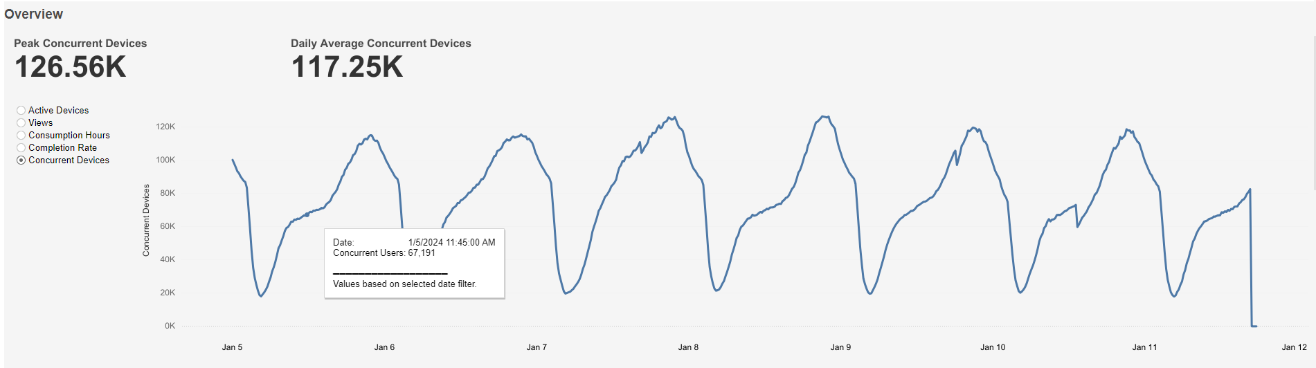
Concurrent Devices graph
This graph shows Peak Concurrent Devices at the top left, Daily Average Concurrent Devices at the top right, and a graph of Concurrent Users over time based on the selected time interval. A mouseover tooltip gives further information.
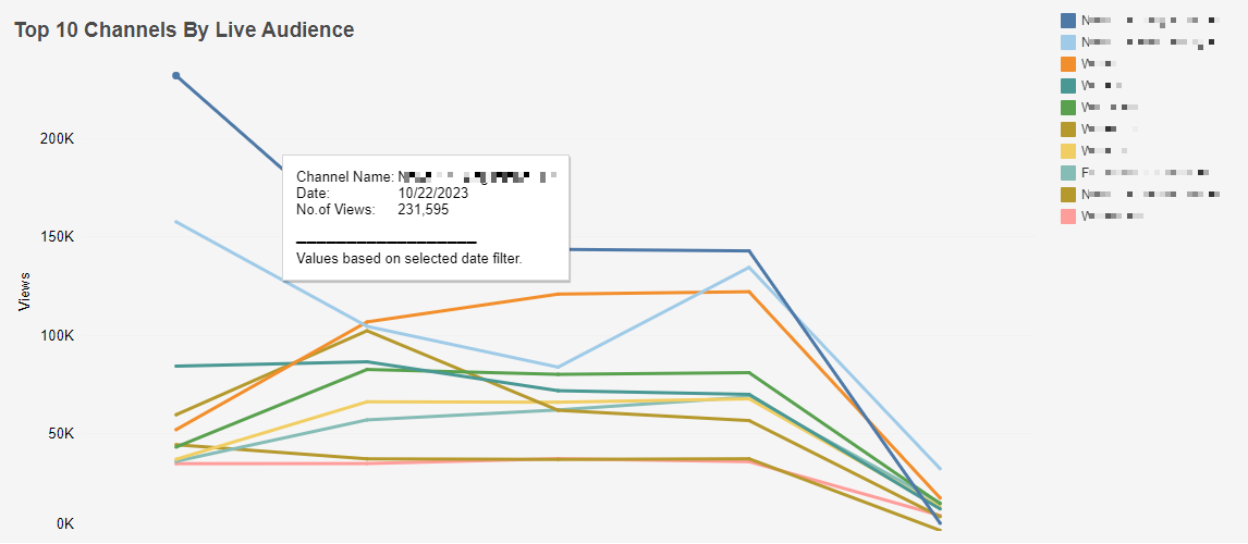
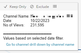
Top 10 Channels By Live Audience
This chart ranks the Top 10 Channels By Live Audience by Views within the selected time interval. A colour legend is shown to the right of the chart. Individual bars can be highlighted by single-clicking. Users can navigate to channel drill-down by following the link. The mouseover tooltip gives further information.
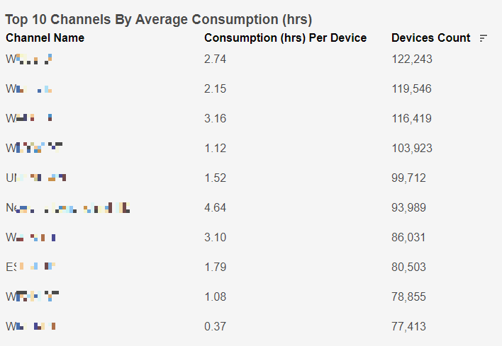
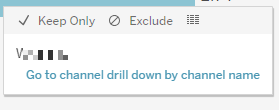
Top 10 Channels By Average Consumption (hrs)
This chart ranks the Top 10 Channels By Average Consumption (hrs) by Device Count within the selected time interval. Individual rows can be highlighted by single-clicking. Users can navigate to channel drill-down by following the link. The mouseover tooltip gives further information.
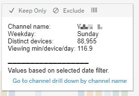
Top 10 Channels By Daily Consumption (mins)
This chart ranks the Top 10 Channels By Daily Consumption (mins) by viewing minutes per device per day within the selected time interval. Individual rows can be highlighted by single-clicking. Users can navigate to channel drill-down by following the link. The mouseover tooltip gives further information.

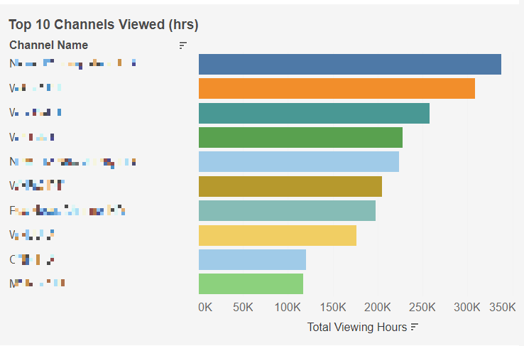
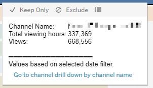
Top 10 Channels Viewed (hrs)
This chart ranks the Top 10 Channels Viewed (hrs) by Total Viewing Hours within the selected time interval. Individual bars can be highlighted by single-clicking. Users can navigate to channel drill-down by following the link. The mouseover tooltip gives further information.
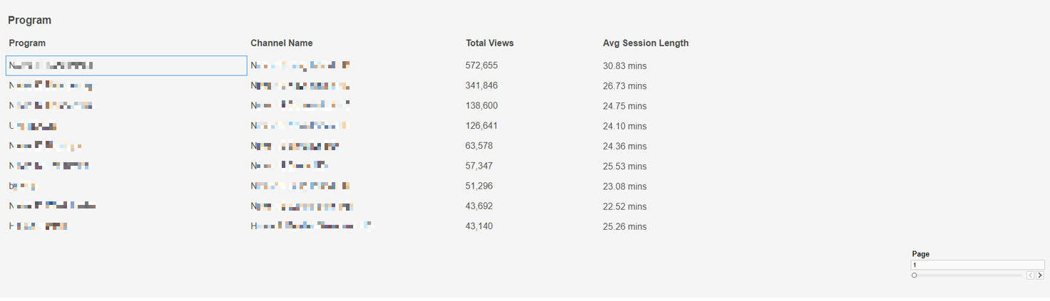
Program Table
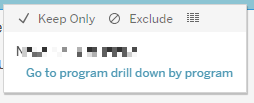
This table shows columns for Program, Channel Name, Total Views, and Avg Session Length. Individual rows can be highlighted by single-clicking. Users can navigate to program drill-down by selected program by following the link. The mouseover tooltip gives further information.