Configurable branding on OpenTV ION for TV
Focus
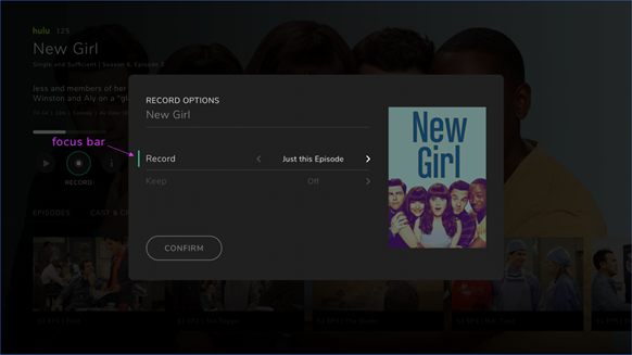
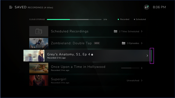
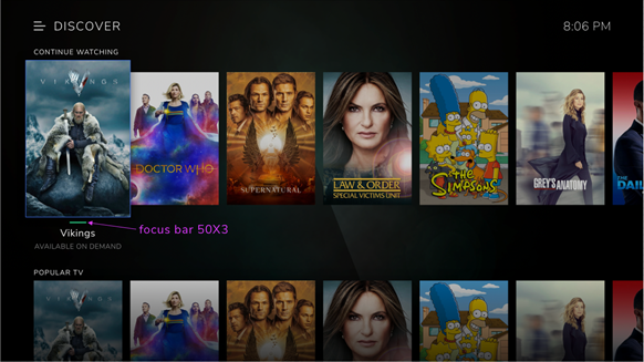
Focus in the OpenTV ION UI is partially denoted by either a horizontal or vertical bar as shown below. The color of this bar is configurable and, for the purposes of this section, is called the “focus color”. The size of focus bar is 50 x 3px.
In-focus items also brighten and scale up when in focus. The weight of any text also increases when in focus.
Horizontal focus bar

Vertical focus bar
Splash screen
The splash screen is made up of three entities:
A background image
A logo
An animation
Background image
The background image ensures that the logo and animation are clearly visible and stand out.
Logo
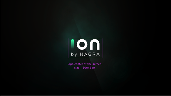
The following image represents the ideal placement of the logo. The main consideration is keeping some level of separation between the logo and the animation.
Placement of logo
Animation
The only configurable items in the animation are the colors of the highlighted dot and the unhighlighted dot. These two colors are configurable, subject to the constraint that the highlighted color is the same as the focus color.
Main menu
In the main menu, the configurable items are:
Logo
Text color
Focus bar color
Logo placement
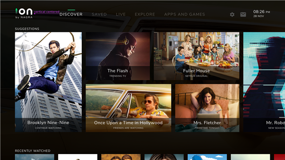
The most important consideration for logo placement is to maintain the centered design of the main menu. The distance between the first menu item and the logo is the same as the distance between the last menu item and the Settings icon.
The logo’s center of mass is vertically centered with the menu items. Note that if the logo is too big, it will encroach on the safe area at the top of the screen.
Logo placement

Logo and menu items vertically centered
Text
The focused/unfocused colors and the weight of the main menu text are configurable.
Main menu text

Focus bar
The color of the focus bar is configurable.
Main menu focus bar

Example customization of logo and main menu
The following is an example with a new logo, new focus bar color and increased font weight for the menu item in focus. The text colors are unchanged.

TimeLine
The TimeLine is the feature for accessing recently watched content and accessing recommendations.
The following items are configurable:
All text color and weight
Icons
Progress bar
Left and right cues
Text
The color and weight of all text is configurable.
TimeLine text items that are configurable
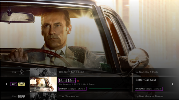
Icons
The Record and Start Over icons are PNGs and can be swapped out if the size is maintained.
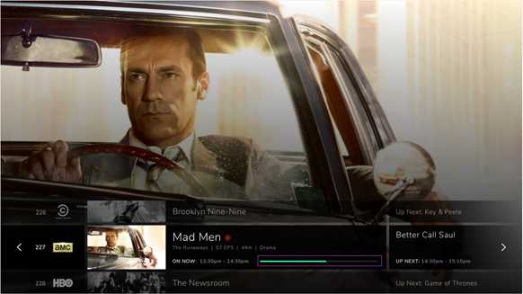
Progress bar
The colors of the progress bar are configurable subject to the constraint that the progress will be the same color as the focus color.
Progress bar
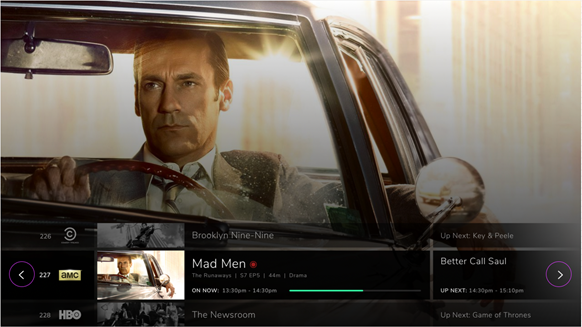
The left/right cues
The left/right cues are arrow icons that can be swapped out. The color and opacity of the circles they sit in are configurable.
Left/right cues
Recents
The following items are configurable:
Text color and weight
Progress bar colors
Text
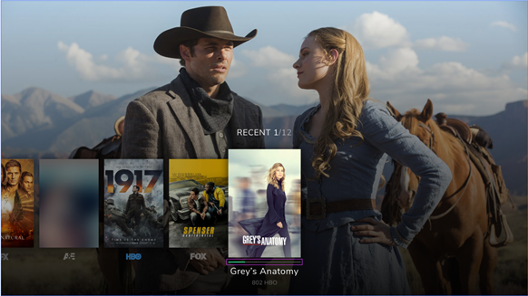
The color and weight of all text is configurable.

Progress bar
The colors of progress bar are configurable subject to the constraint that the progress color is the same as the focus color.
Progress bar
EPG
The following items are configurable:
All text
Background cell color of in-focus item
Background color behind the time markers
Any icons (if the size is maintained)
Text
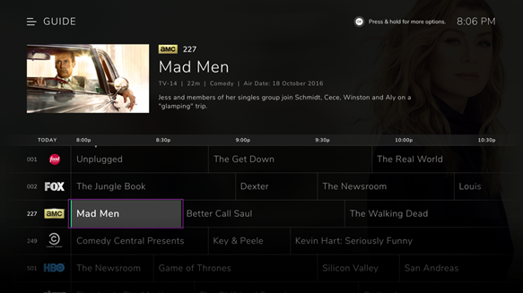
The color and weight of all text is configurable.
Background color of in-focus cell
The color and opacity of the in-focus cell is configurable.
In-focus cell
Icons
All icons in the EPG can be swapped out if the replacement icon size is the same. Note that icon usage needs to be consistent across the UI, so icons swapped out in the EPG must also be swapped out elsewhere.
Discover menu
Magazine view
The following items are configurable:
All text
Poster overlays
Focus bar
Text
The color and weight of all text is configurable.
Poster overlays
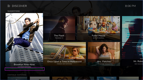
The poster overlays, both in and out of focus, are configurable. The color and opacity are the same whether in or out of focus.

Focus bar
The color of the focus bar is configurable, but must be used throughout the UI.
Poster overlay focus bar color
Content Strips
The following items are configurable:
All text
Focus bar
Text
The color and weight of all text is configurable.
Focus bar
The color of the focus bar is configurable, but must be used throughout the UI.
Content strip focus bar
Saved items
The following items are configurable in the SAVED item list:
All text
Focus color
Progress bars
Icons
Text
The color and weight of all text is configurable.
Focus color
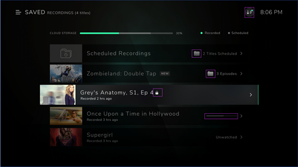
The color of the focus bar is configurable but must be the same color used throughout the UI.
Saved item focus bar

Progress bar and icons
The two colors in the progress bar are configurable. All icons are configurable if size is maintained.
Progress bar and icons
General
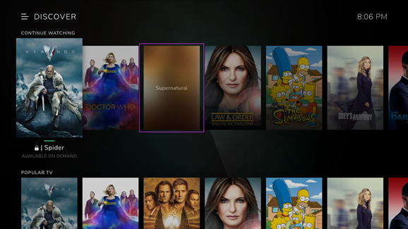
Missing posters
Fallback images are used in place of missing posters. We need to show the event title name on poster. The size should be maintained.
An example of a placeholder graphic
Time and date
The time and date is present in most screens in the top right hand corner. The color and weight of this text is configurable.
Time and date

