
Customization of Subtitle styling
In response to the European Accessibility Act 2025 (EAA), the CONNECT Player SDK provides the ability for customisation of the appearance of text subtitles for HLS content. This allows for enhanced readability where required by the end user through a flexible set of characteristics.
Text of the following subtitle types can be customized:
SRT
SMPTE
WebVTT
Limitation: Closed Captions customization is not supported.
Customization works in conjunction with the iOS/tvOS system settings under the Accessibility settings' “Subtitles & Captioning” controls. There are a set of predefined standard styling combinations, plus the ability for the user to define their own combinations.
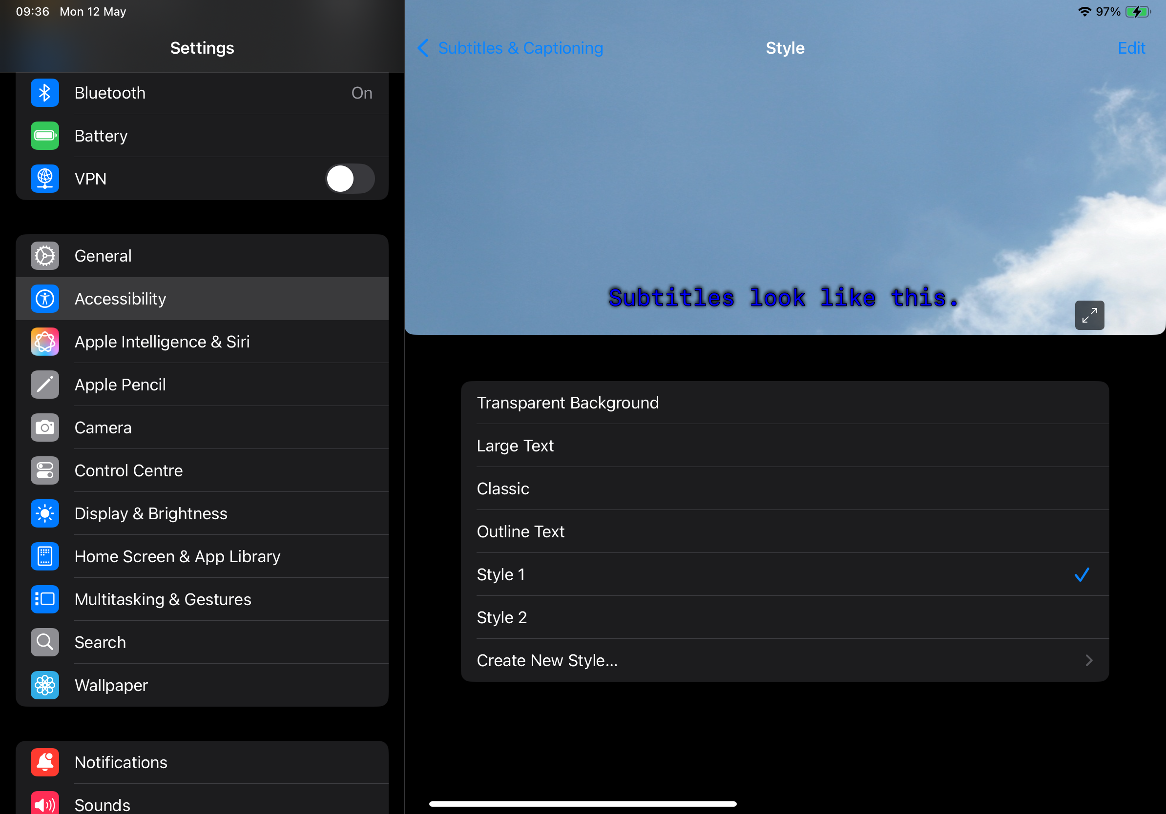
“Subtitles & Captioning” controls
This feature’s configuration options can further refine individual settings. Care should be taken that system settings permit the Video Override for each attribute, for example:
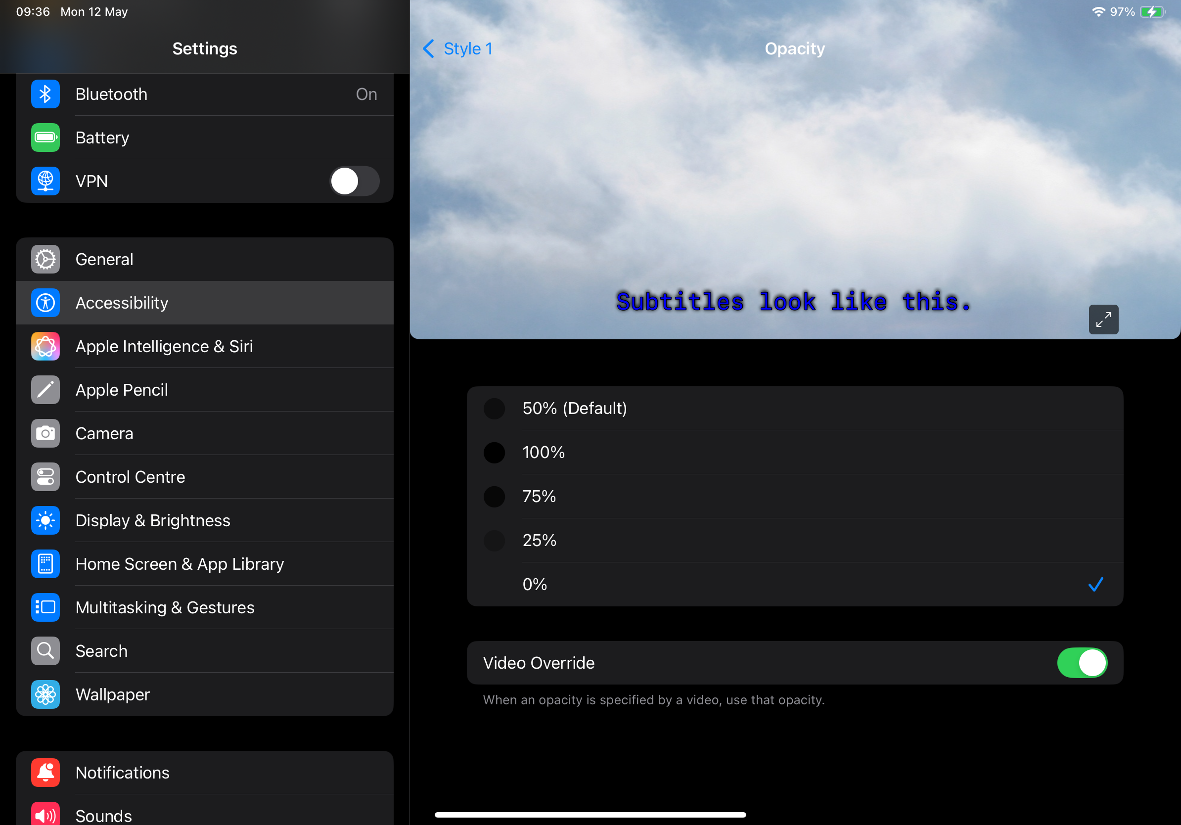
Video Override allowed
Customisation of the following styling properties is supported:
font size scaling
font family
text color / text opacity
background color / background opacity
text edge effect
Each of the attributes are defined Optional so can be isolated individually or combined as required.
API
An API entry point is defined to set these attributes via method call on the player passing an instance of the class OTVTextStyle in which each of the the attributes can be set, for example:
let txtStyle = OTVTextStyle()
txtStyle.textSizeScaleFactor = 2.0
txtStyle.fontFamily = "Times New Roman"
txtStyle.textColor = UIColor.yellow
txtStyle.backgroundColor = UIColor.blue.withAlphaComponent(0.75)
txtStyle.characterEdgeEffect = OTVTextStyleCharacterEdge.uniform

player.configureTextStyle(styling: txtStyle)
Text scale factor
Default behaviour is for 24 pt text to be shown. The textSizeScaleFactor attribute allows that value to be scaled by the provided factor.
Examples:
a value of
2.0will double the rendered sizea value of
0.5will half the sizea value of
1.5will increase by 50%a value of
1.0(default) will have no effect
It is recommended to integrators that a small set of values are defined and mapped to meaningful labels, for example:
small:
0.75medium:
1.0large:
1.5extra large:
2.0
Futhermore it is not recommended going beyond 2.0 as the layout of the rendered subtitles may be greatly affected and readability will likely be affected.
Bear in mind that 24 pt reflects the default and mid point of the iOS System Accessibility Settings' “Display & Text Size” control.
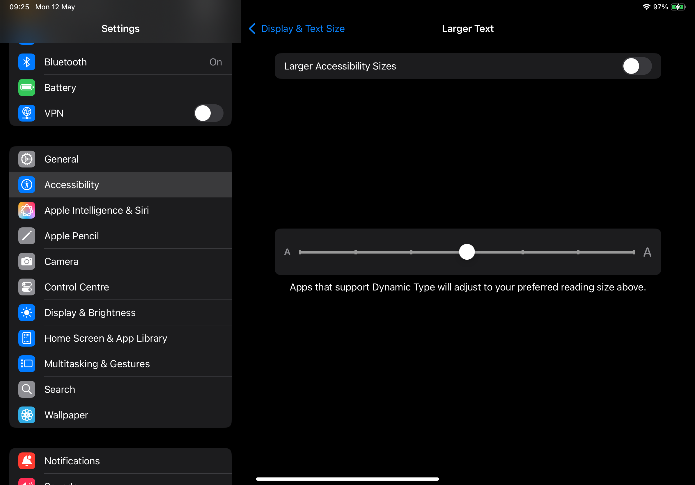
iOS System Accessibility Settings' “Display & Text Size”
Both the system scaling and textSizeScaleFactor will affect the displayed size. When “Larger Accessibility Sizes” is toggled on the range of options increases further.
Font family
Default behaviour is for the system settings selected font to be used. The fontFamily attribute allows any string font name to be passed.
It is the application integrator’s responsibility to ensure the font is available.
Text color / opacity
Default behaviour is for the system settings selected text color and opacity to be used.
Opacity takes a value from 0.0 (transparent) to 1.0 (opaque).
Opacity cannot be overridden without also overriding the color.
Examples:
txtStyle.textColor = UIColor.whitetxtStyle.textColor = UIColor.yellowtxtStyle.textColor = UIColor.white.withAlphaComponent(0.8)
Background color / opacity
Default behaviour is for the system settings selected background color and opacity to be used.
Opacity takes a value from 0.0 (transparent) to 1.0 (opaque).
Opacity cannot be overridden without also overriding the color.
Examples:
txtStyle.backgroundColor = UIColor.blacktxtStyle.backgroundColor = UIColor.bluetxtStyle.backgroundColor = UIColor.black.withAlphaComponent(0.8)
Character Edge Effect
Default behaviour is for the system settings selected edge style to be used. The set of valid values are defined in the enumeration:
public enum OTVTextStyleCharacterEdge: String, Codable {
    case none
    case dropShadowed
    case uniform
    case raised
    case depressed
}
Examples:
txtStyle.characterEdgeEffect = .dropShadowedtxtStyle.characterEdgeEffect = .depressed
Unlike other platforms there is no native support for character edge color customisation.